
Bonjour !
J’espère que vous allez bien ! Aujourd’hui j’ai combiné deux challenges pour faire cette carte : Less is More et Time OUT.
Mais avant tout je voulais féliciter Less is More qui non seulement fête ses 6 ans (bravo !) mais qui a aussi donné un magnifique coup de jeune à leur site ! Bravo Mesdames pour tout ce que vous faîtes, j’ai beaucoup appris depuis bientôt 2 ans grâce à vous toutes et vos superbes créations ! Il en est de même pour vous Mesdames de Time OUT ! Je vous dédie cette carte, vous, mes amies de blogland !
Hello !
I hope you’re fine ! Today I combined two challenges to make this card : Less is More and Time OUT.
But first of all, I want to congratulate Less is More who not only celebrates its 6th birthday (bravo !) but who also gave a wonderful boost to their site relooking it ! Bravo Ladies for everything you do, I’ve learned a lot since almost two years thanks to you all and your superb creations ! It is the same for you Ladies of Time OUT ! I dedicate this card to you, my friends of bogland !
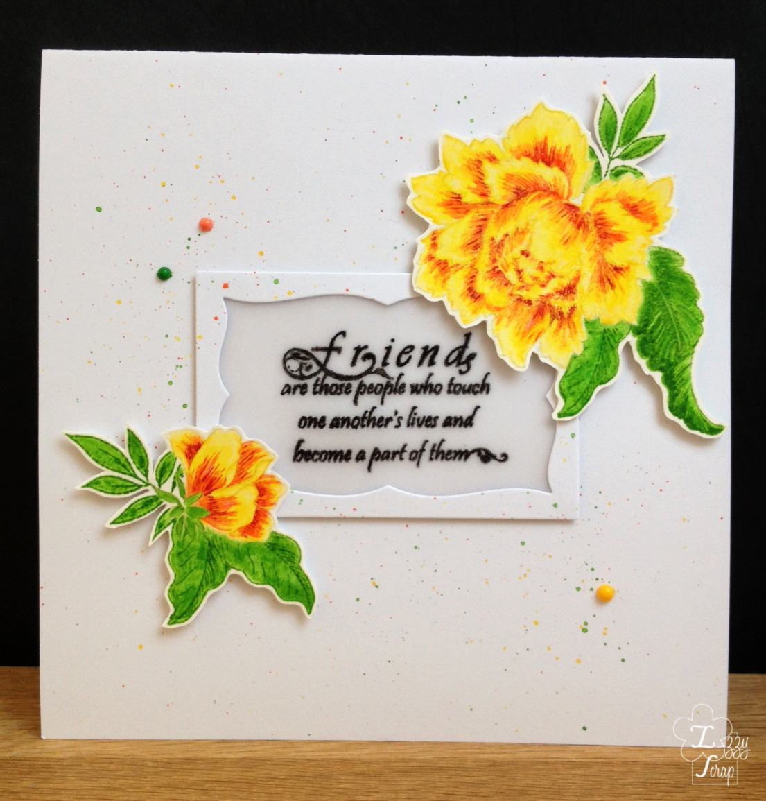
 Pour le challenge de Less is More il faut faire une carte en choisissant 3 couleurs adjacentes. Je dois vous avouer qu’il m’a été très difficile de ne pas choisir dans les tons bleus/verts !
For the challenge of Less is More, we have to make a card with 3 adjacent colours. I must confess you that it has been very difficult not to choose some blue/green tones !
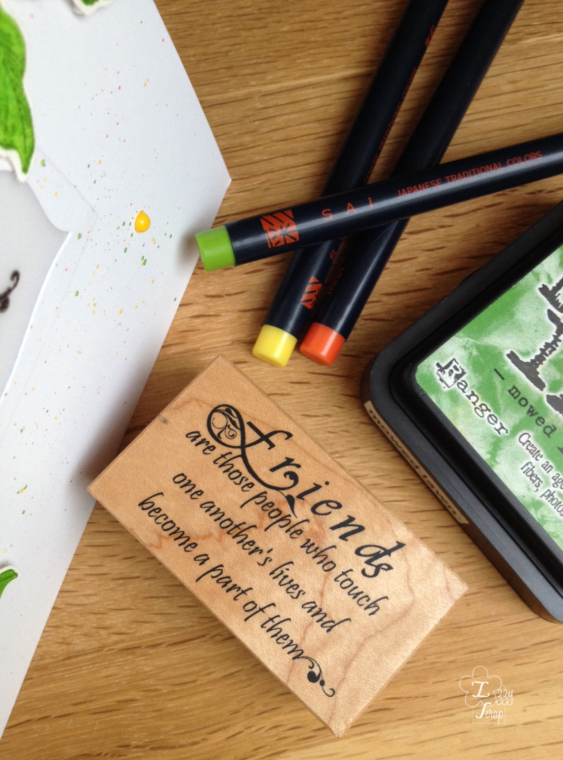
Je voulais essayer aussi le papier aquarelle de chez Arches qui a un grain très fin ainsi que mes crayons pinceau aquarelle.
I also wanted to try the watercolour paper from Arches which has a very fine grain as well as my watercolour brush pens.
Donc j’ai tamponné avec une encre distress très claire les contours des fleurs. Puis sur le tampon de fond, j’ai mis une couche de jaune avec le crayon jaune et j’ai tamponné dans les contours. Avec un pinceau humide j’ai étalé la peinture aquarelle. J’ai fait la même chose pour la couche orange. Par contre j’ai gardé la finesse du trait pour la partie la plus foncée.
Then I stamped with a very light colour the outlines of the flowers. On the background stamp, I layered yellow with the brush pen and I stamped into the outlines. With a wet brush I spread out the watercolour layer. I did the same for the orange layer. On the contrary, I kept the fineness of the line for the darkest layer.

J’ai tamponné le sentiment sur un papier vellum avec de l’encre Versafine et j’ai embossé avec de la poudre transparente. J’ai découpé un cadre avec une matrice de découpe. J’ai positionné ce cadre sur la double carte en ayant protégé l’intérieur avec un post it et j’ai fait des éclaboussures toutes fines avec les 3 couleurs pour ajouter un peu de couleur sur ce grand fond tout blanc mais en restant très neutre pour garder un style CAS.
I stamped the sentiment on a vellum paper with Versafine ink and I heat embossed with clear powder. I die cut a frame. I placed this frame over a double white card by having protected the inside with a post-it note and I made very fine splashes all over with the 3 colours to add a little bit of colour on this great white background but remaining very neutral to keep a CAS style.

Pour finir j’ai collé le vellum au dos du cadre puis je l’ai monté sur la double carte avec de la mousse adhésive. J’ai aussi collé les fleurs avec de la mousse adhésive et j’ai collé 3 perles qui rappellent les couleurs du thème choisi. N’ayant pas de perles de couleur j’ai juste mis du vernis à ongle sur des perles blanches et j’ai laissé sécher toute la nuit ! Et voilà, le résultat est plutôt concluant !
To finish I glued the vellum to the back of the frame and I foam mounted it on the double card. I also foam mounted the flowers and I glued 3 beads which remind the colours of the chosen theme. As I do not have coloured beads, I brushed nail polish on white beads and I let them dry all night ! And voilà, the result is rather good !
Merci pour votre visite et n’hésitez pas à me laisser un commentaire, je suis toujours ravie de vous lire. À très bientôt j’espère ! 😀
Thank you for your visit and feel free to leave me a comment, I am always delighted to hear from you. See you soon I hope ! 😀
Fournitures / Supplies :
- Clairefontaine : Double white card
- Arches : Hot pressed Watercolour paper
- Akashiya SAI : Watercolour brush pens
- Distress ink : moved lawn
- Altenew : peony bouquet
- K-Kingdom : DT-0734 (sentiment)
- Impression Obsession die : rectangle 6 in 1 frames
- Versafine : Onyx Black
Challenges
Less is More #314 Colour wheel
Time OUT #76 Inspired by words


Wow, Isabelle … your colouring is fantastic … these blooms are so detailed and beautiful … and frame that wonderful (and true!) sentiment wonderfully! Thanks so much for your lovely words too … it’s a joy to us that you find Time Out so inspiring! Delighted to have you playing along with us again! Bises, Anita 🙂
Thank you so much Anita !
Super jolie est ta carte avec le cadre et le vellum entouré de ces fleurs magnifiques! Les couleurs sont radieux! La colorisation est parfaite!
Merci beaucoup Susanne !
Your card is absolutely stunning. Love those beautiful flowers and how you created your sentiment window. Thanks so much for playing along at Time Out.
Thank you so much Joyce !
I never tire of seeing these beautiful peonies Izzy. You watercolouring is beautiful, and you did the splatters so well, they are just perfect. I always have to hold my breath when I do them as I never know what may happen! The design is gorgeous too, this card must have taken you a long time to do. And the nail polish on the gems is a great idea! You can also colour them with alcohol markers, so you need never buy coloured ones! You are making me want to pull out my peony set – thank you for your inspiration! Have a wonderful weekend, Lisa xx
Thank you so much Lisa ! I’ve tried to colour them with alcohol markers but the beads have already a glossy varnish on them and the markers does not fix well !
this is gorgeous, love the layout and frame
thanks for celebrating our 6th birthday with us at Less Is More this week
Jen xxxx
Thanks Jen !
Izzy, this is beautiful! I love the classy frame and with the sunny blooms, and what a fabulous idea to use your nail polishes! And thank you so much for your kind words about LIM, I’m so happy we give you lots of inspiration.
Thanks so much for sharing with us at Less is More, Anita x
Thanks Anita for your kind comment and for inspiring every week with new challenge and inspiration cards !
Deux jolis challenges combinés pour une superbe carte.
Joli travail de colorisation !
J’espère avoir également un peu de temps pour faire un ou deux de ces sympathiques challenges autour de l’amour et l’amitié.
Bises.
Merci Estelle !
Absolutely stunning Izzy! What a gorgeous layout, and in such beautifully bright, vivid colours too <3 I love the vellum panel with the sentiment which adds a really sophisticated touch, and I'm wowed at your brilliant idea of using nail polish to cover the dots (plus, what amazing colours of nail polish you have – I'm quite jealous!). Thanks so much for playing along with us at Less is More 🙂
Thanks ever so much Esther ! You made my day !
Such a beautiful card, with a perfect sentiment. Love it! Thanks for sharing at Less is More!
Thank you Susan !
such a pretty card!! love the cas design and beautiful flowers. The sentiment is great!
cheers
preety
Thank you Pretty, you’re so kind !
Beautiful card, great use of the colours. lovely layout
Thanks Aileen !
Stunning! I am swooning at the beauty of this incredible card Izzy. Perfect placement of the flowers and that sentiment is just wonderful. Your stamping and embossing on the vellum is so crisp and clean. I absolutely adore the delicate splatters on the background and that fab frame. Thank you so much for sharing this with us at Less is More xx
Thank you Sharon for your lovely comment !
Such a beautiful card -and beautiful words about blogland! 🙂 The vellum looks so pretty, this is a great design, and you’ve used one of my favorite flower stamps… I like the water color look you’ve created for them. Thanks for joining us at TIME OUT!
Thanks ever so much Nonni !