

Bonjour !
J’espère que vous allez bien et que vous vous préparez à passer un bon weekend de Pâques (même si c’est en confinement une fois de plus !). Aujourd’hui c’est un nouveau défi qui commence chez Less is More avec un thème Couleurs : Rose, Gris et Or.
Hello !
I hope that you are fine and that you prepare yourself to spend a lovely Easter weekend (even if we are in lockdown one more time !). Today it’s a new challenge that starts over at Less is More with a Colour theme : Pink, Grey and Gold.

Voici ma carte / Here is my card
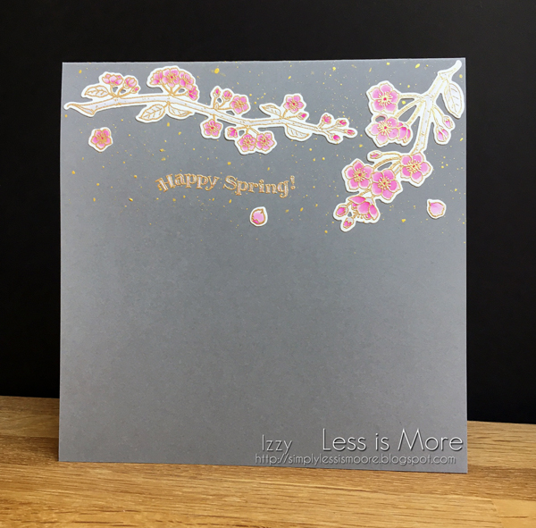
 Deux de nos voisins ont des cerisiers en fleurs actuellement et les jours où il y a un peu de vent, de jolis pétales voltigent partout dans notre jardin. C’est cette vision qui m’a inspirée pour cette carte.
Two of our neighbours have cherry trees in full bloom at the moment, and on windy days, lovely petals flit all over our garden. It is this vision that inspired me for this card.
J’ai gagné, il y a quelque temps déjà, ce joli set de tampons et ses matrices mais je ne l’avais encore jamais utilisé. Voilà c’est chose faite !
Some time ago, I won this pretty stamps set and the matching dies and I had never used it yet. Voilà, it’s done !
J’ai tamponné les deux branches et les pétales sur du papier, je les ai colorés avec des crayons pinceaux puis je les ai découpé avec les matrices correspondantes.
I stamped the two branches and the petals on a white Neenah card stock and I watercoloured them with brush pens then I cut them with the matching dies.
Je les ai collés sur une double carte grise sur laquelle j’ai tamponné le sentiment que j’ai embossé avec de la poudre or.
I flat adhered them on a double grey card on which I also stamped the sentiment and I heat embossed it with gold powder.
Pour finir, j’ai masqué les deux branches et j’ai fait des éclaboussures avec de l’encre or pour illustrer ce joli mouvement des fleurs qui voltigent.
To finish, I masked the two branches and I splattered gold ink to illustrate this pretty mouvement of the fluttering blossoms.
Stamp : Impression Obsession “Pink clouds” – Die : Impression Obsession “Pink clouds” – Watercolour Brush pens : Zig Real Colour brush “#025, 026, 097”.
Et voilà ! J’espère que ma carte vous inspirera et que vous viendrez nombreux jouer avec nous et n’oubliez pas, il y a encore plus d’inspiration sur le blog principal ICI avec les cartes de mes coéquipièr(e)s. Merci pour votre visite et tous vos gentils commentaires !
And Voilà ! I hope that my card will inspire you and that you will come to play with us and don’t forget, there is even more inspiration on the main blog HERE with my teamies’ cards. Thank you for visiting and all your lovely comments !
Challenges
AAA cards CAS game #186 – Along the Edge
Simon Says Wednesday challenge – anything goes
Simon Says Monday challenge – Easter/Spring
Time Out #184 – Inspired by Words
Love to Scrap #144 – Spring forward
Try it on Tuesday – Hello Spring
Make my Monday #145 – Easter or Spring card
Shopping our Stash #442 – Here Comes Peter Cottontail
NBUS Challenge #25


![]()


![]()
![]()
So pretty! Thanks so much for sharing with us over at Love To Scrap Challenge Blog this month! We appreciate you joining us!
Hugs,
Leslie, LTSCB DT
Love To Scrap 2
I love the cherry blossoms on the gray background, with the added glitz of gold. Such a pretty card! Thanks for joining in at Shopping Our Stash!
Happy Spring indeed! Your beautiful cherry blossoms are a wonderful welcome to the season – I love the way they pop against the dark card base with the perfect amount of splatter! I can imagine how much your neighbour’s trees must have inspired you 🙂 Thanks so much for joining us at TIME OUT!
Fabulous cards. I love the grey, pink and gold combination. Thank you for joining the AAA Cards Challenge.
– Joy Dsouza
You are soo good at CAS! Love how you usedthe grey cardstock and pink flowers in your design and the gold splatters are so pretty too. Thank you for joining us at AAA cards with this beautiful card. Hugs ~ Ishani.
Your cheery cherry blossom design and coloring are just perfect for a springtime design, Izzy! It makes me happy! Thank you for sharing with everyone at NBUS! Enjoy your day! Hugs, Darnell
So gorgeous and elegant, Izzy … delicate with a touch of lovely whimsy in the dainty splatter and curvy sentiment! Les cerisiers sont tous en fleurs autours de nous aussi … ils sont tellement jolis … j’attend les fruits, maintenant … miam! Grosses bises, Anita 🙂
This is beautiful! Thanks for joining us at Make My Monday.
Your card is beautiful Izzy. We have cherry blossom tree’s growing along the road and the blossom looks gorgeous against the bright blue sky. When it flutters around it reminds me of wedding conffetti x
So delicate and so very pretty and loving the colour combination x.
This is so elegant! LOVE it!! Thanks for joining us at Try it on Tuesday!
I love this card, Izzy. Pink and grey is one of my favorite color combinations, and you have used it so beautifully. Love the cherry blossoms, and I can just picture the way the petals blow into your garden. Love the curve of the sentiment, and the splatters are a wonderful finish to your beautiful card.